
1
2
3
4
5
6
7

Illustration . Logo Design
̌
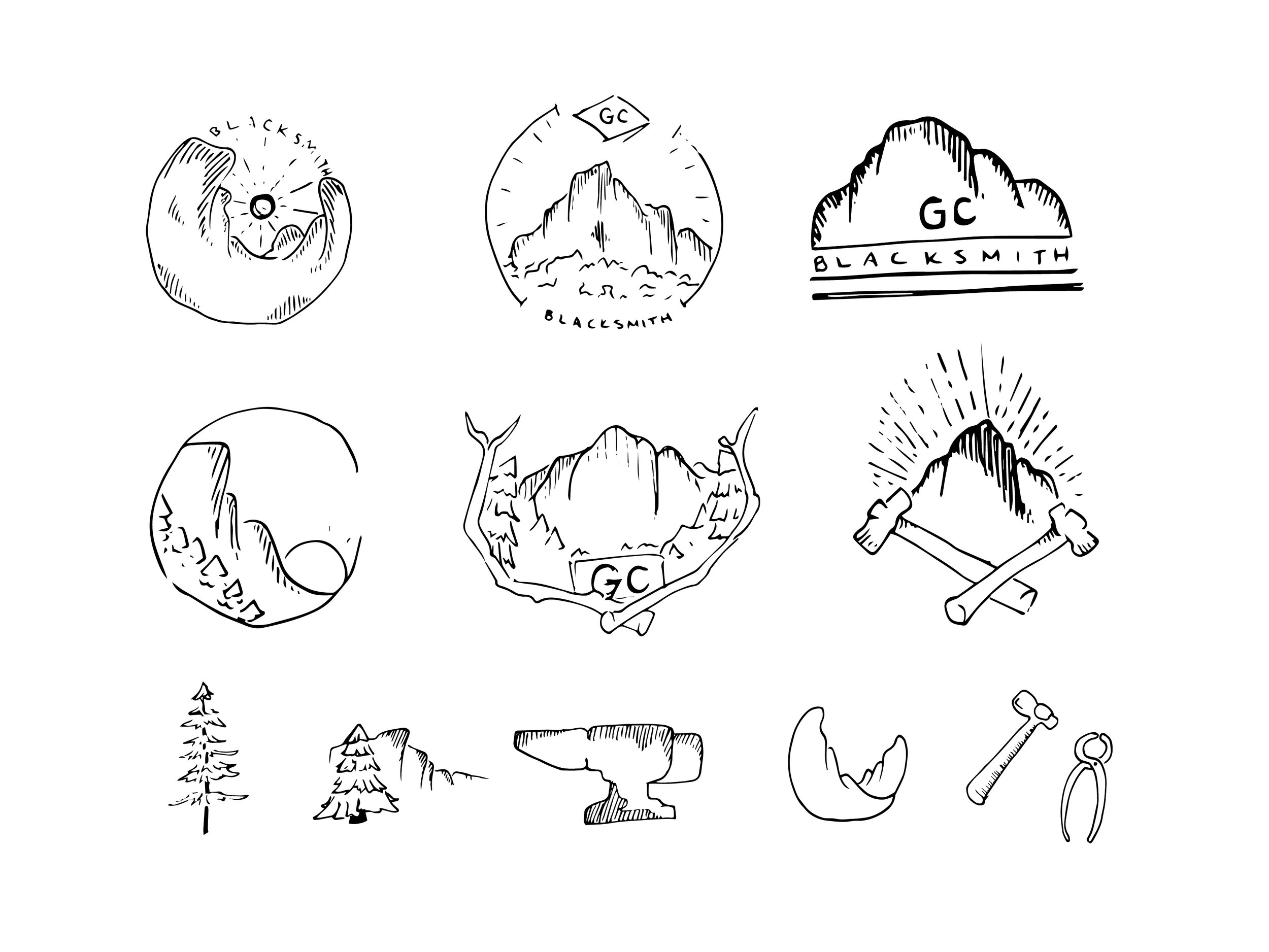
Initial Sketches
The parameters the client wanted me to explore were mountains that represented a tattoo that he had and was focused on nature.
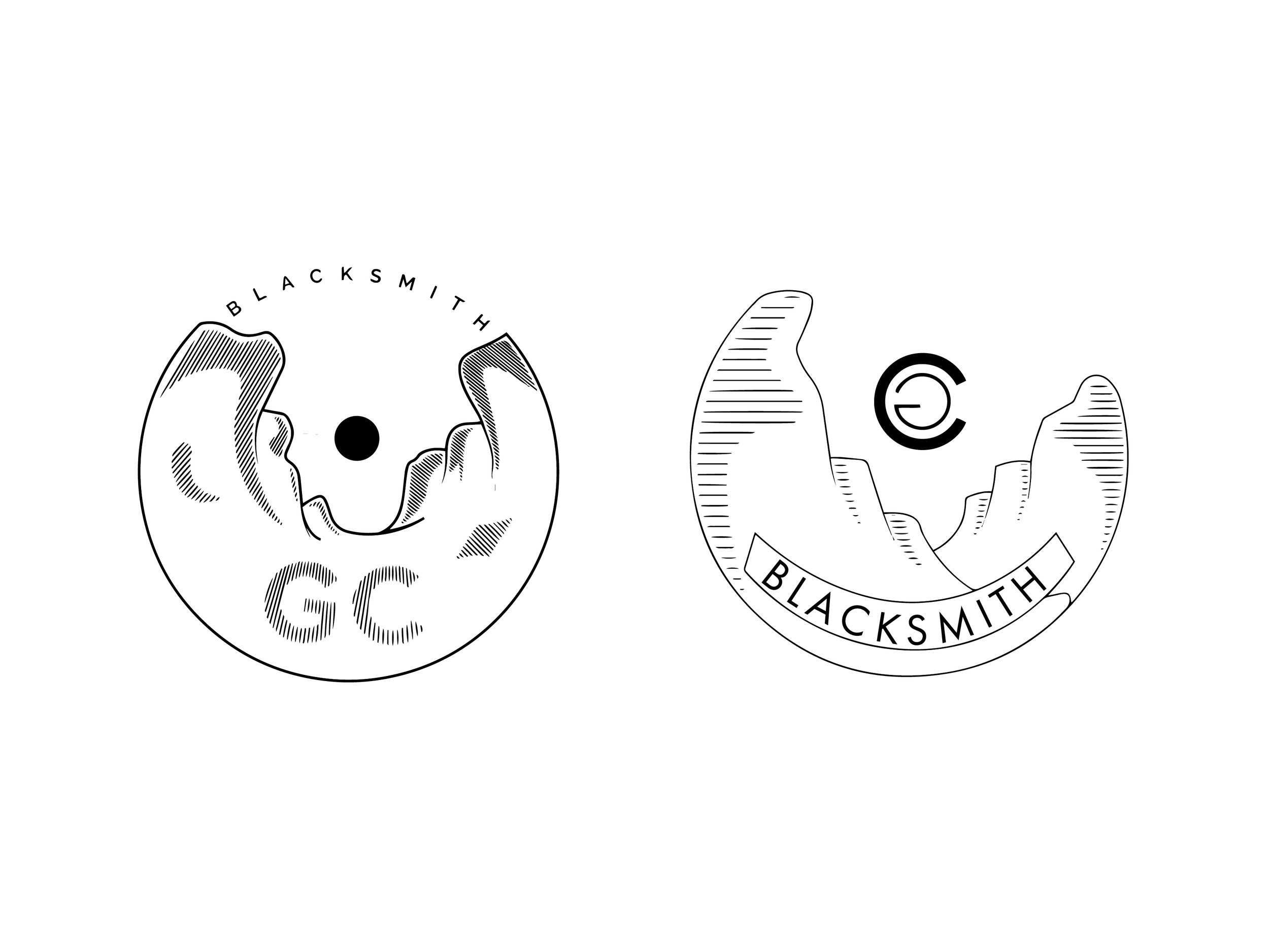
Round Two Exploration
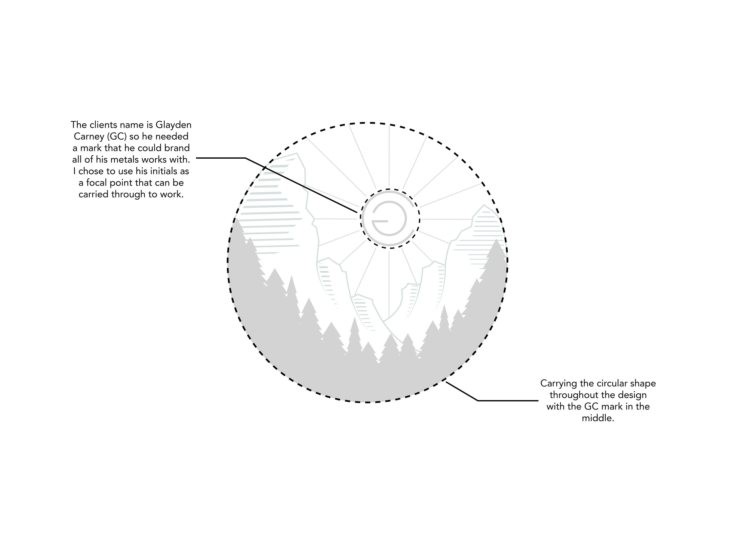
We really liked how the circular logo was feeling, it felt like an emblem that would look good on a hat or a t-shirt. Plus I wanted to continue with the circular marks that you see in the sun and the GC.
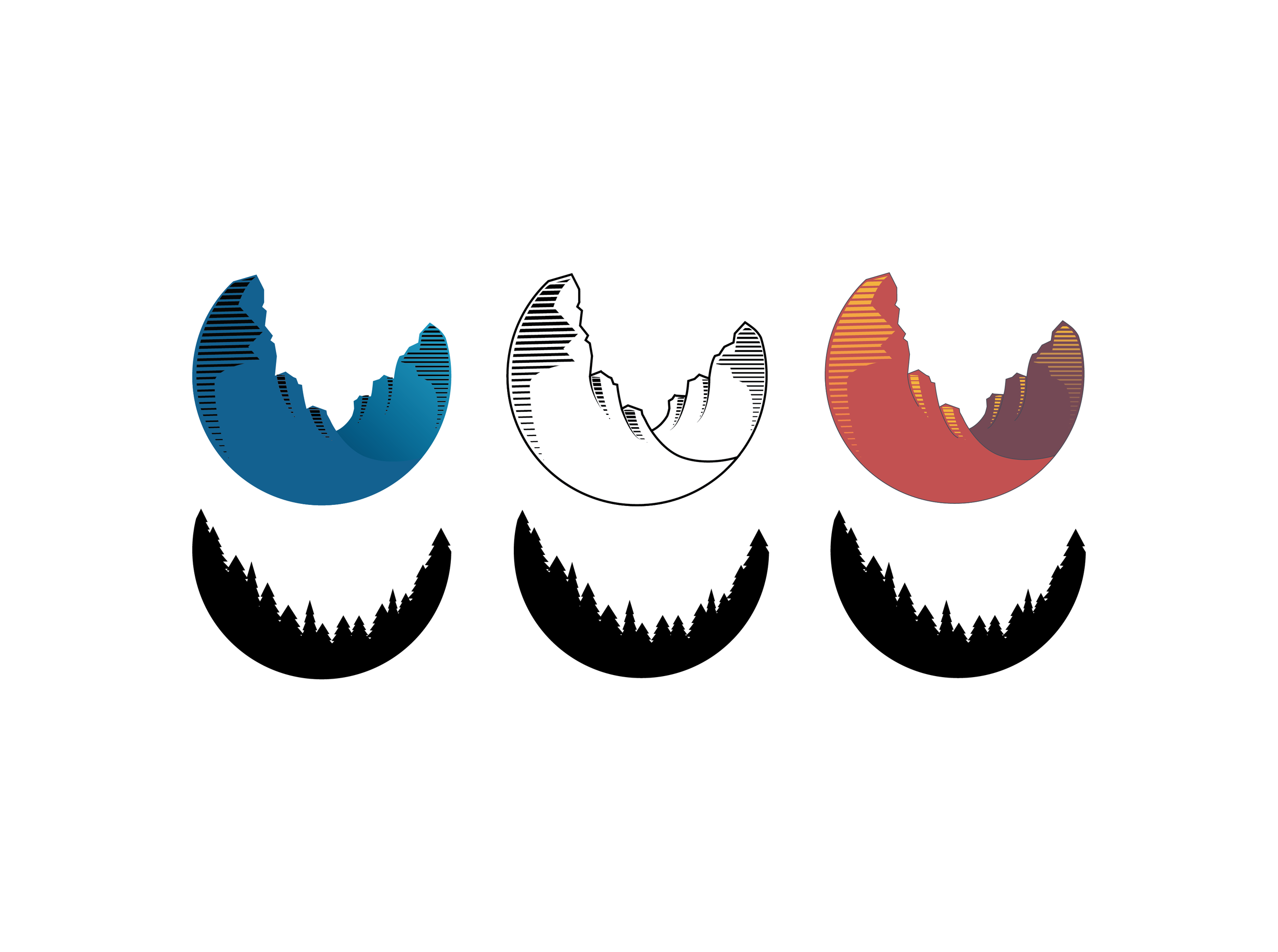
Adding the tree line gave the mountains more of a local feel - more familiar to the client and where he grew up with the Blue Ridge Mountains.
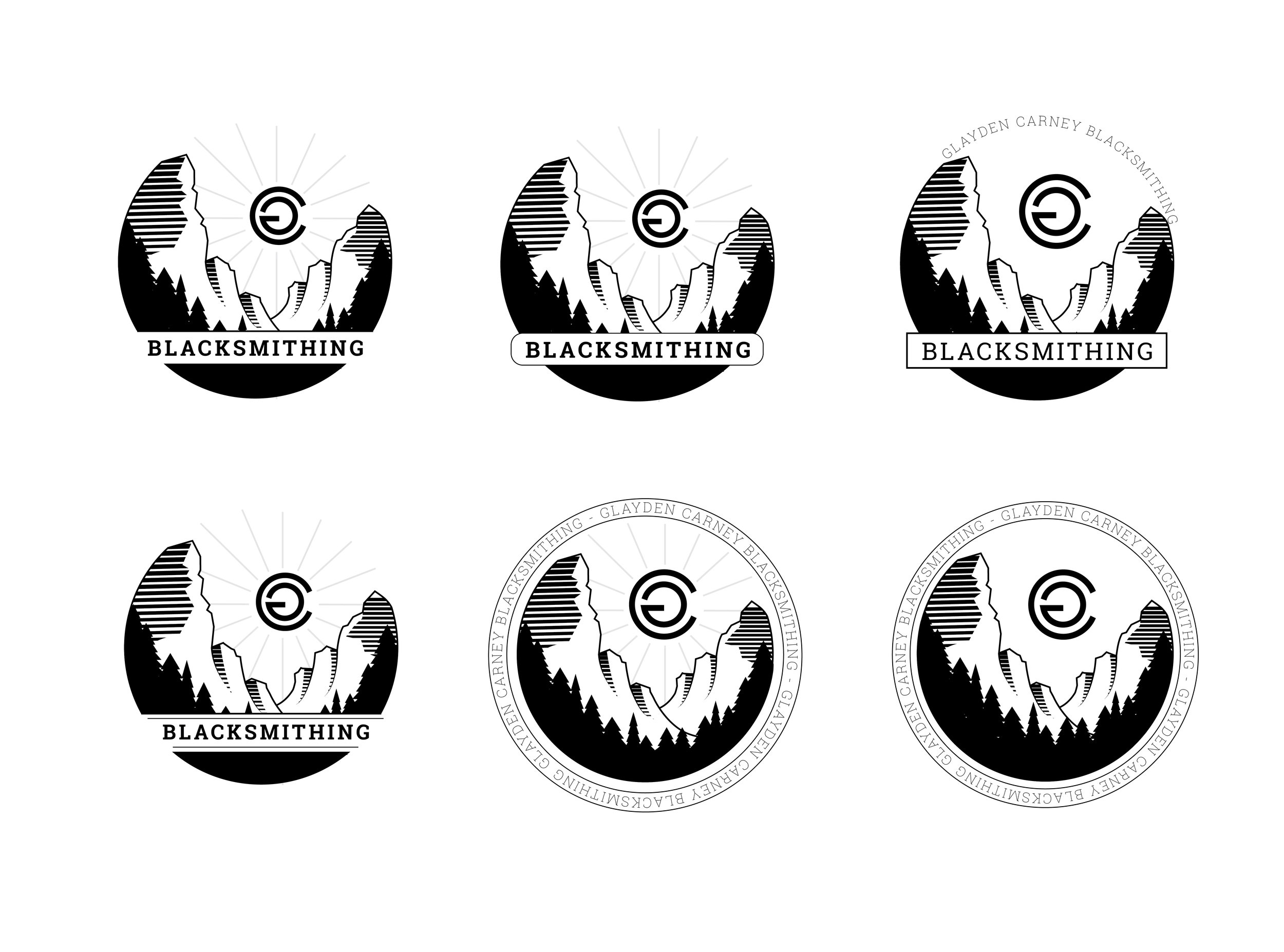
Final Round Exploration
The final logo took a more rigid approach, and added some more dimension with the tree line silhouette and contour lines with the mountains. Also adding the river to resemble the clients tattoo.
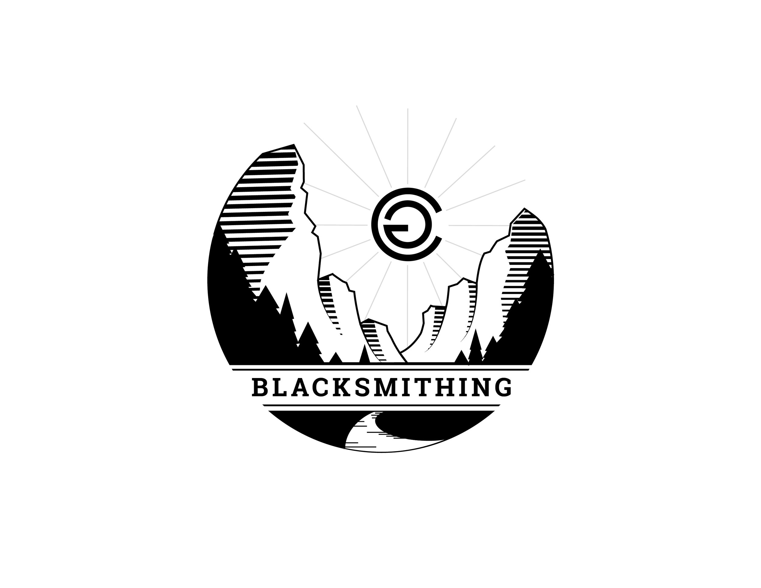
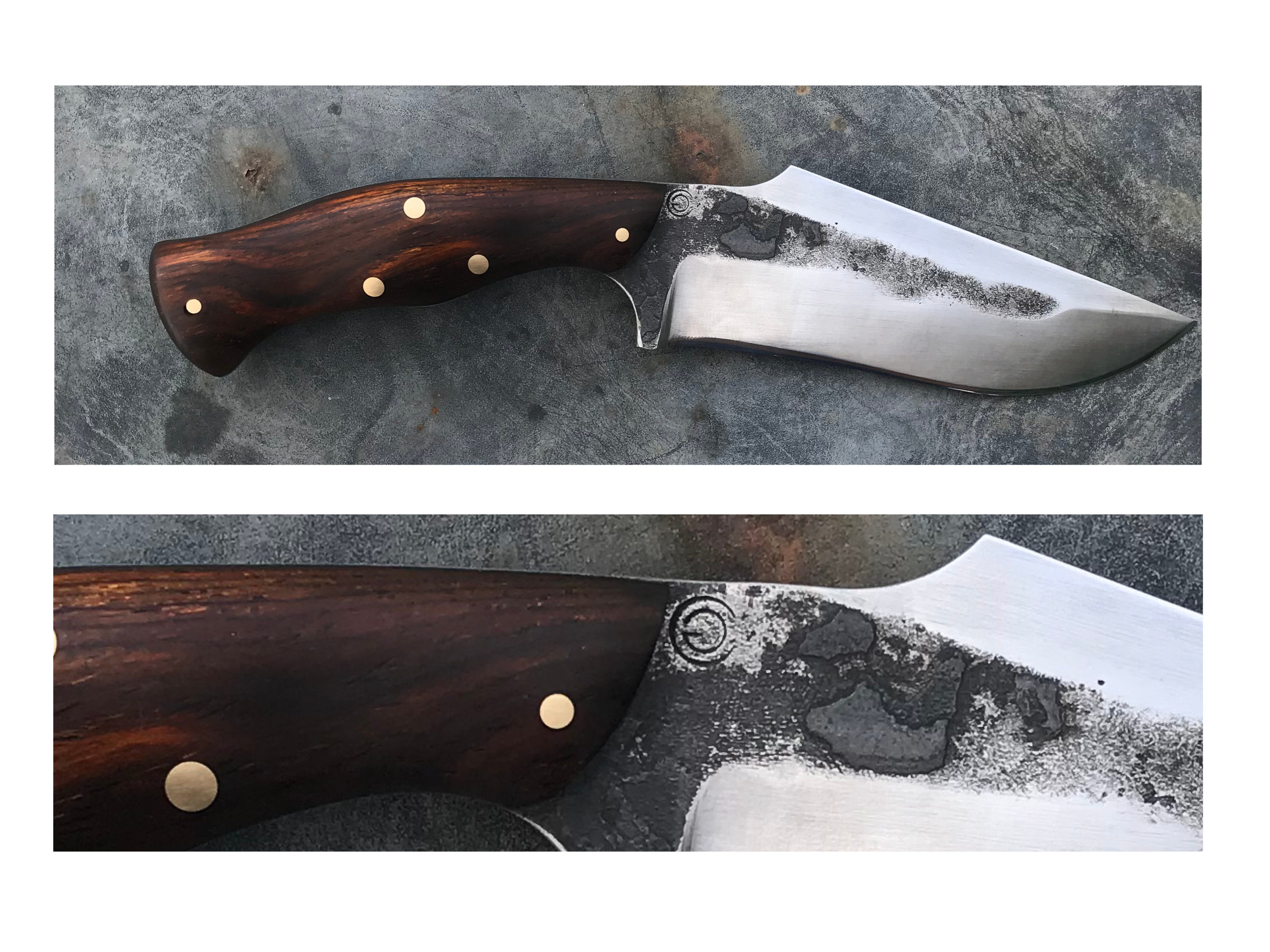
Makers Mark in use